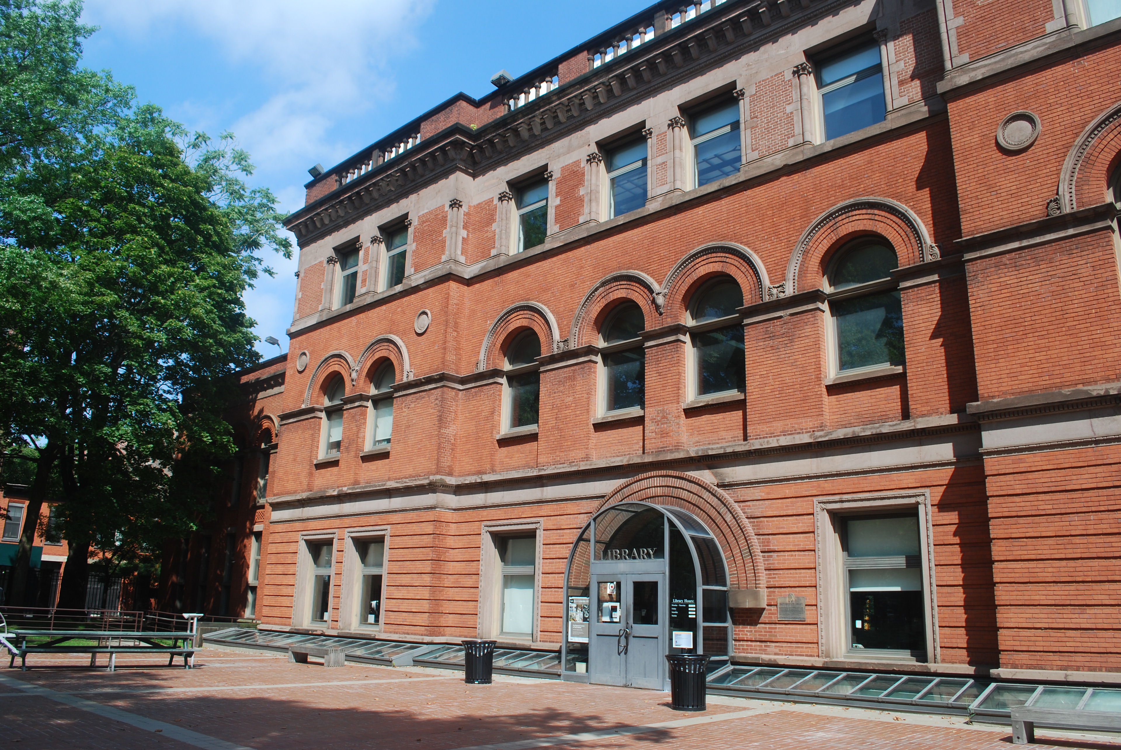
Background
Pratt Institute Libraries intends to provide resources and services in the most effective way possible to their patrons by leveraging their web presence and streamlining their library experience.
They are located at the Brooklyn and Manhattan Campuses of Pratt Institute, a global leader in higher education dedicated to preparing its 4,600 undergraduate and graduate students for successful careers in art, design, architecture, information and library science, and liberal arts and sciences.
The mission of the Pratt Institute Libraries is to provide outstanding service and access to a resource-rich environment that facilitates critical thinking and creative teaching and learning in the Pratt community.
Stakeholder Workshop
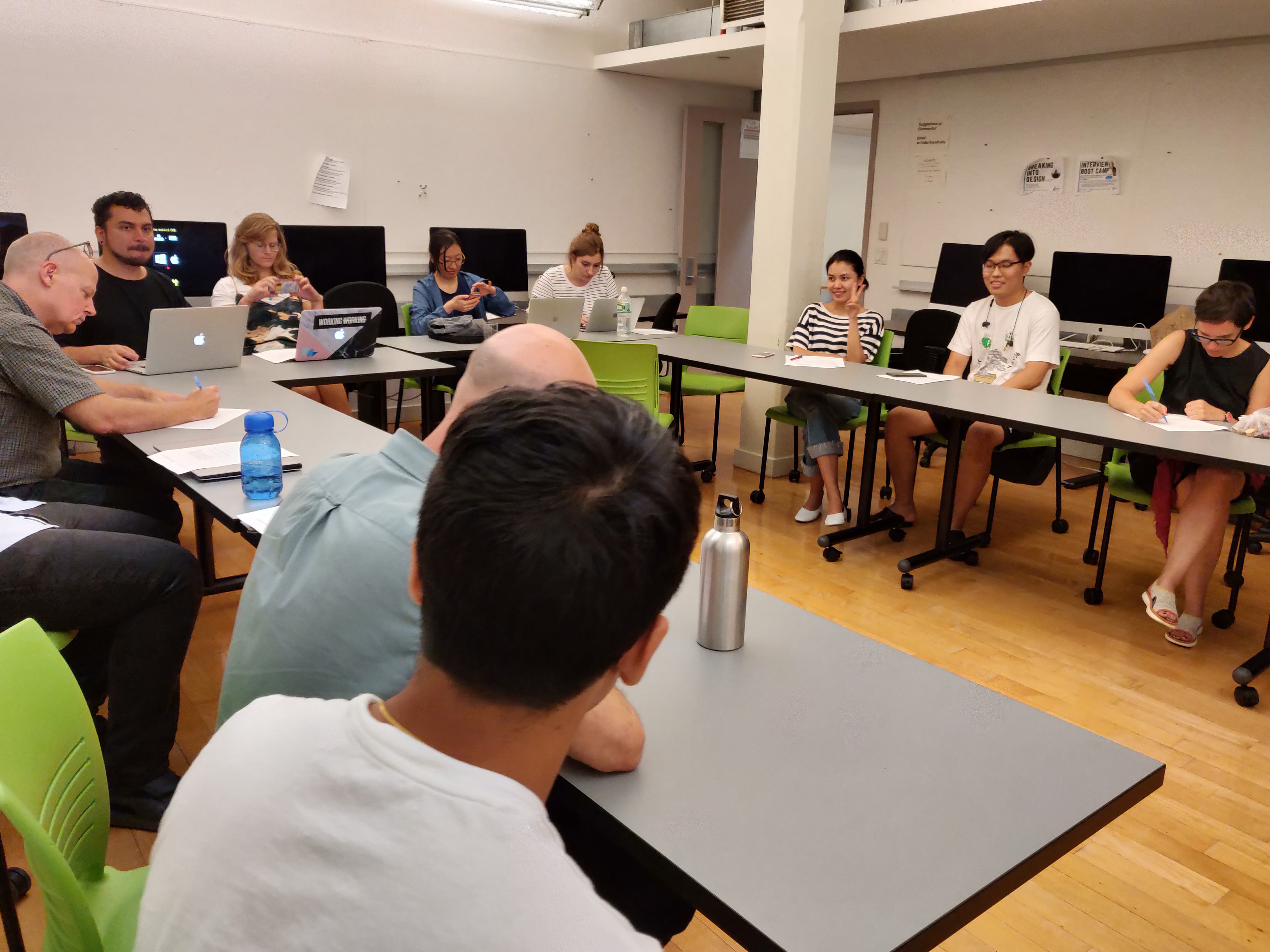
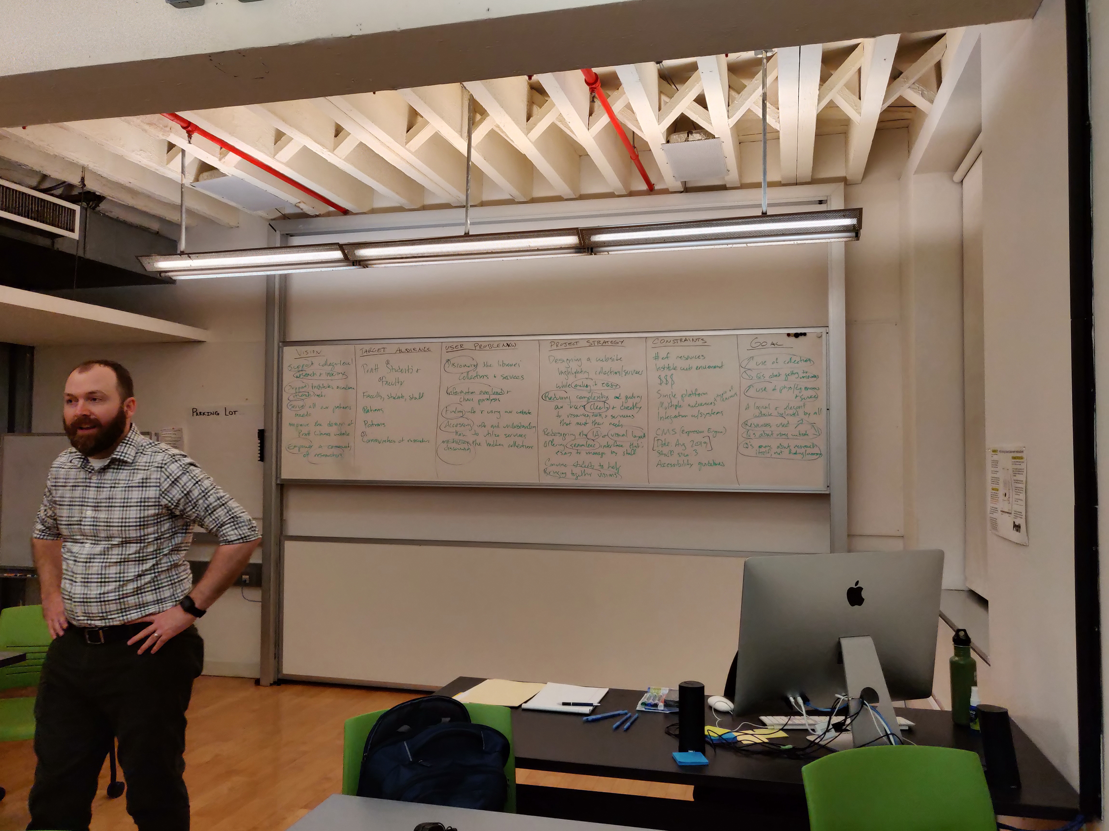
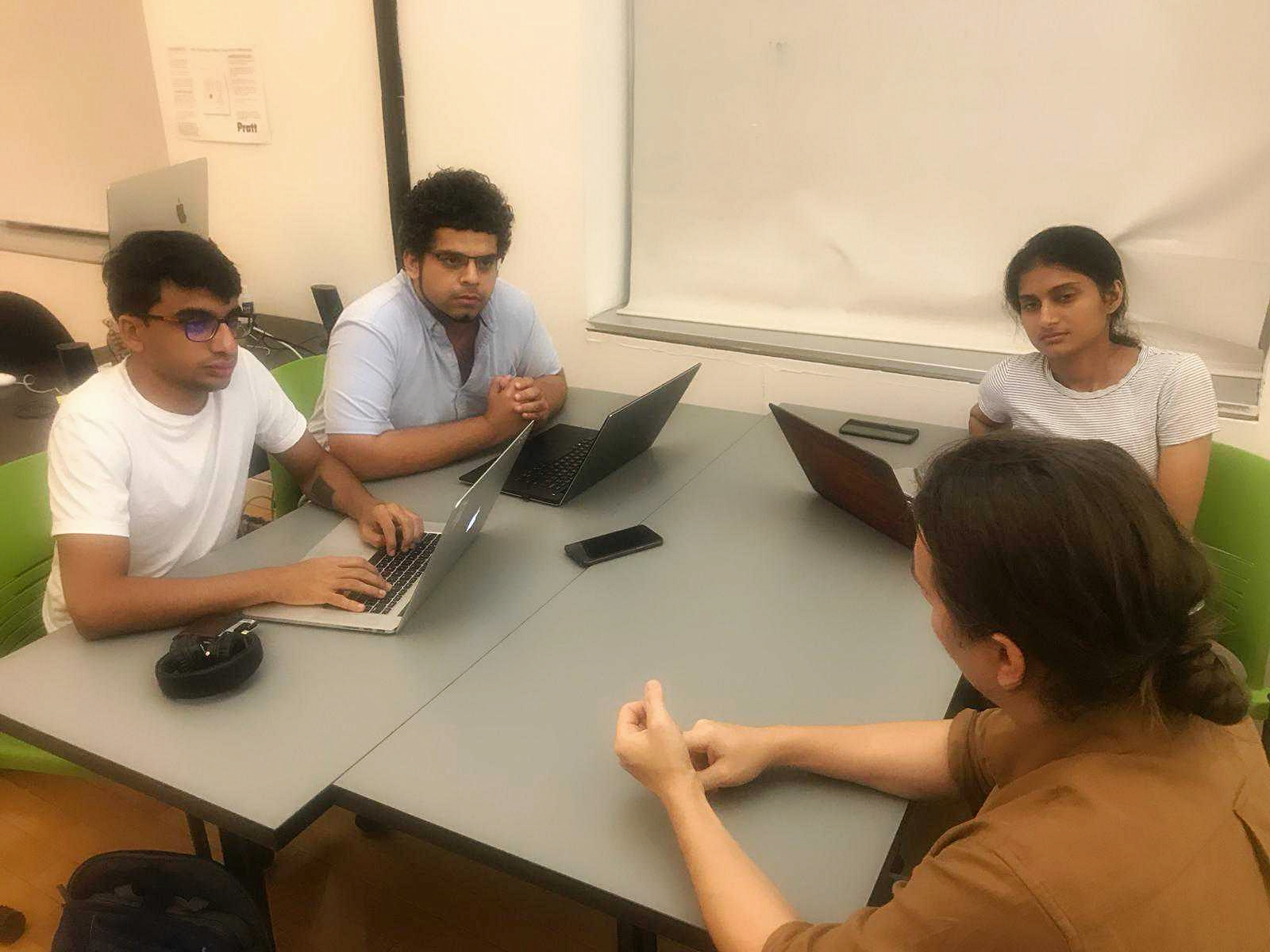
To understand Pratt Libraries needs and expectation, we conducted a Stakeholder workshop. In this workshop, we distributed ourselves in groups of three and each team interviewed one library staff member, asking a set of tailored questions. These questions were focussed on understanding the current state of the library, mission, goals, desirability, viability and feasibility.
Research Goals
After the workshop, we brainstormed on the data collected from the interviews to discover our research goals for the project.
At this point, we divided ourselves in five research groups-
Content Strategy - To redesign the Information Architecture of the website.
Interview/Surveys -To conduct Interviews and Surveys
Literature Review - To review content relevant to Libraries (services, resources)
Competitive Analysis - To conduct peer reviews, analyzing their features, layout based on our project scope.
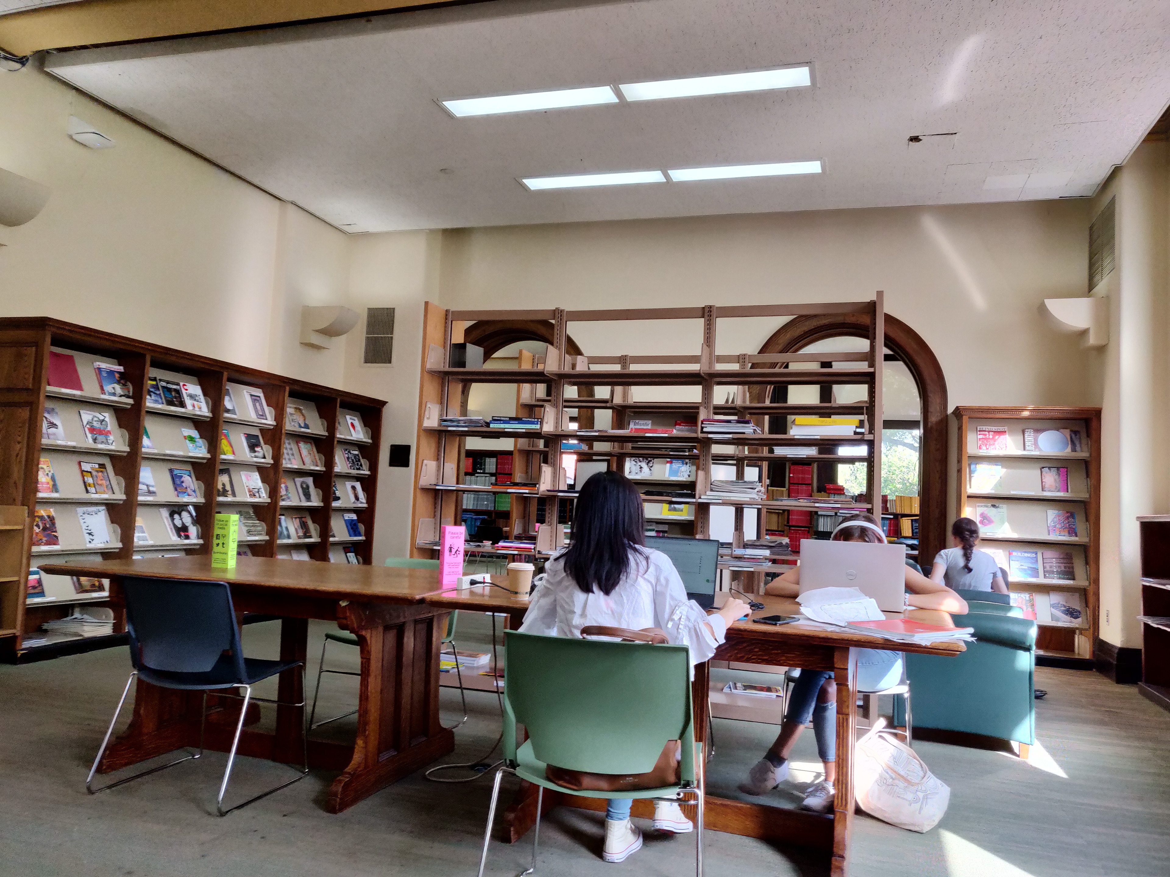
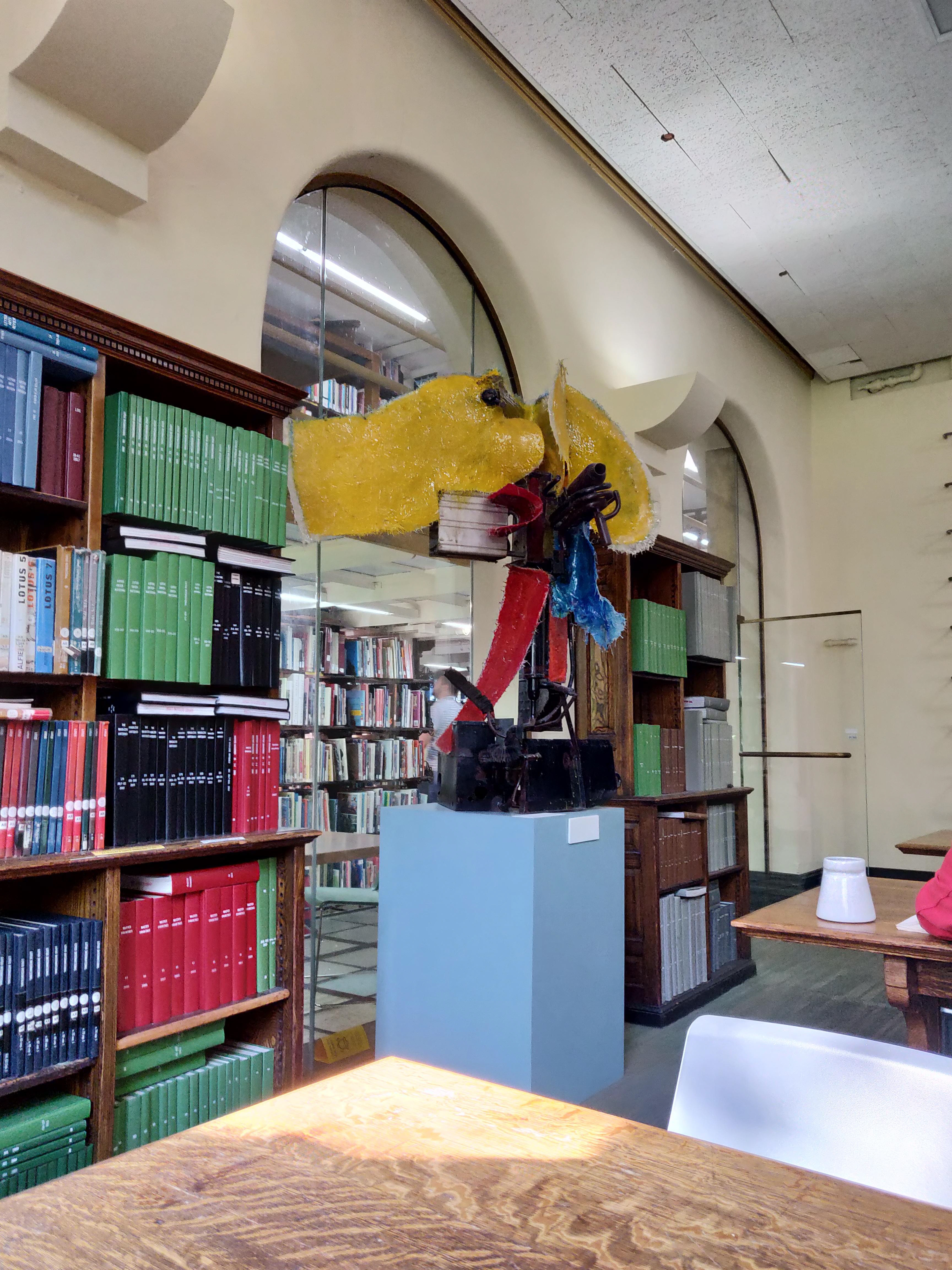
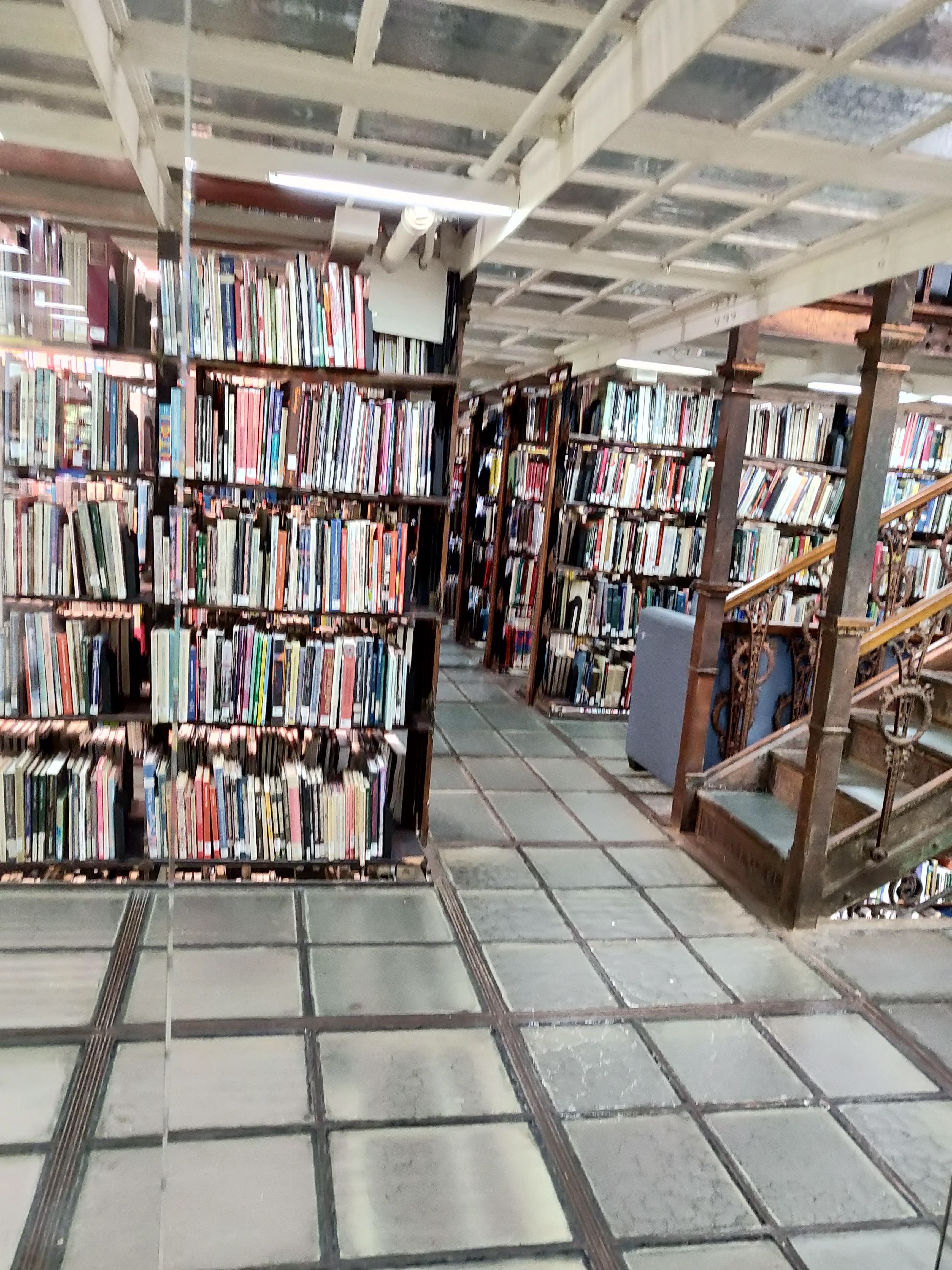
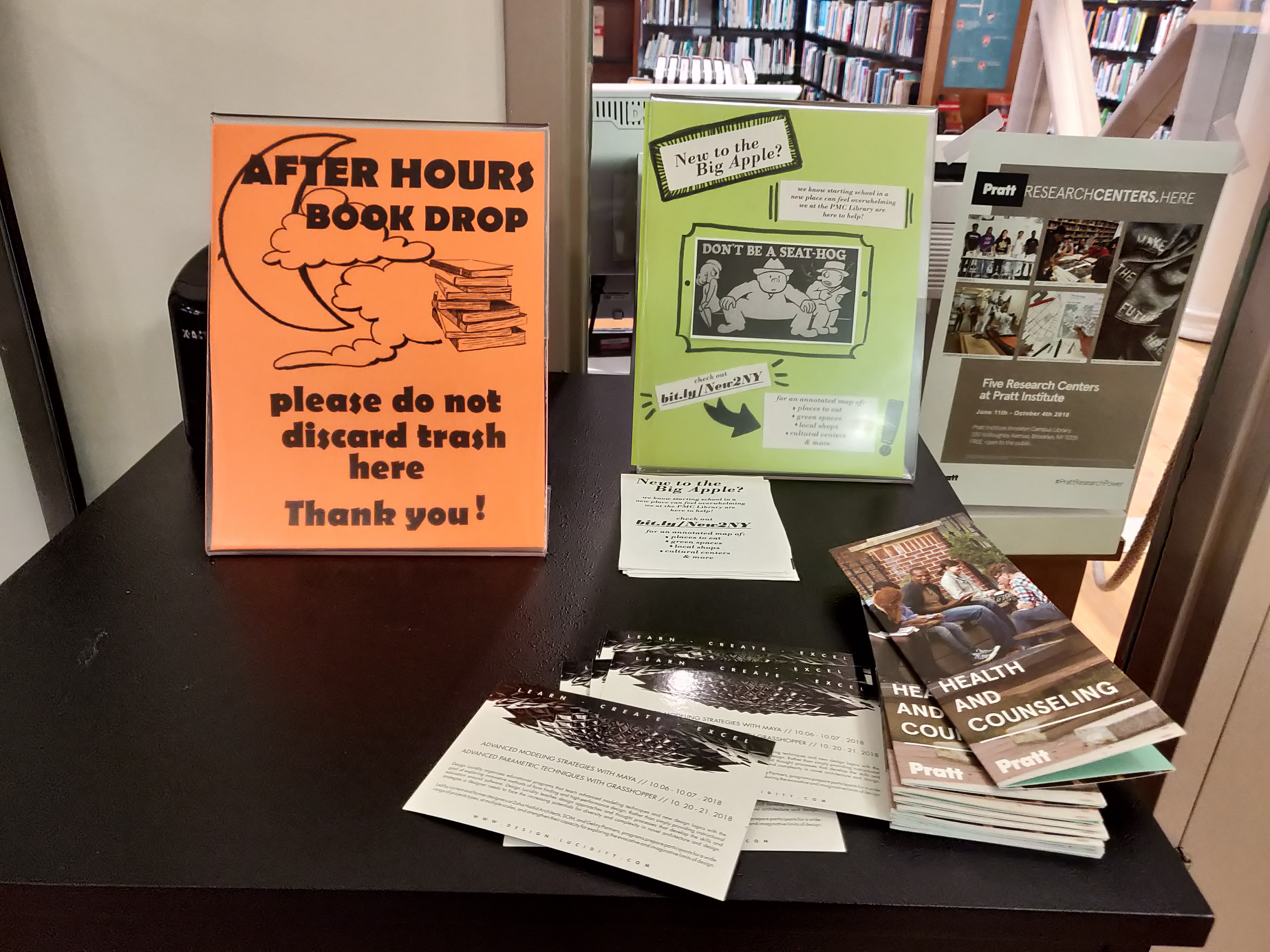
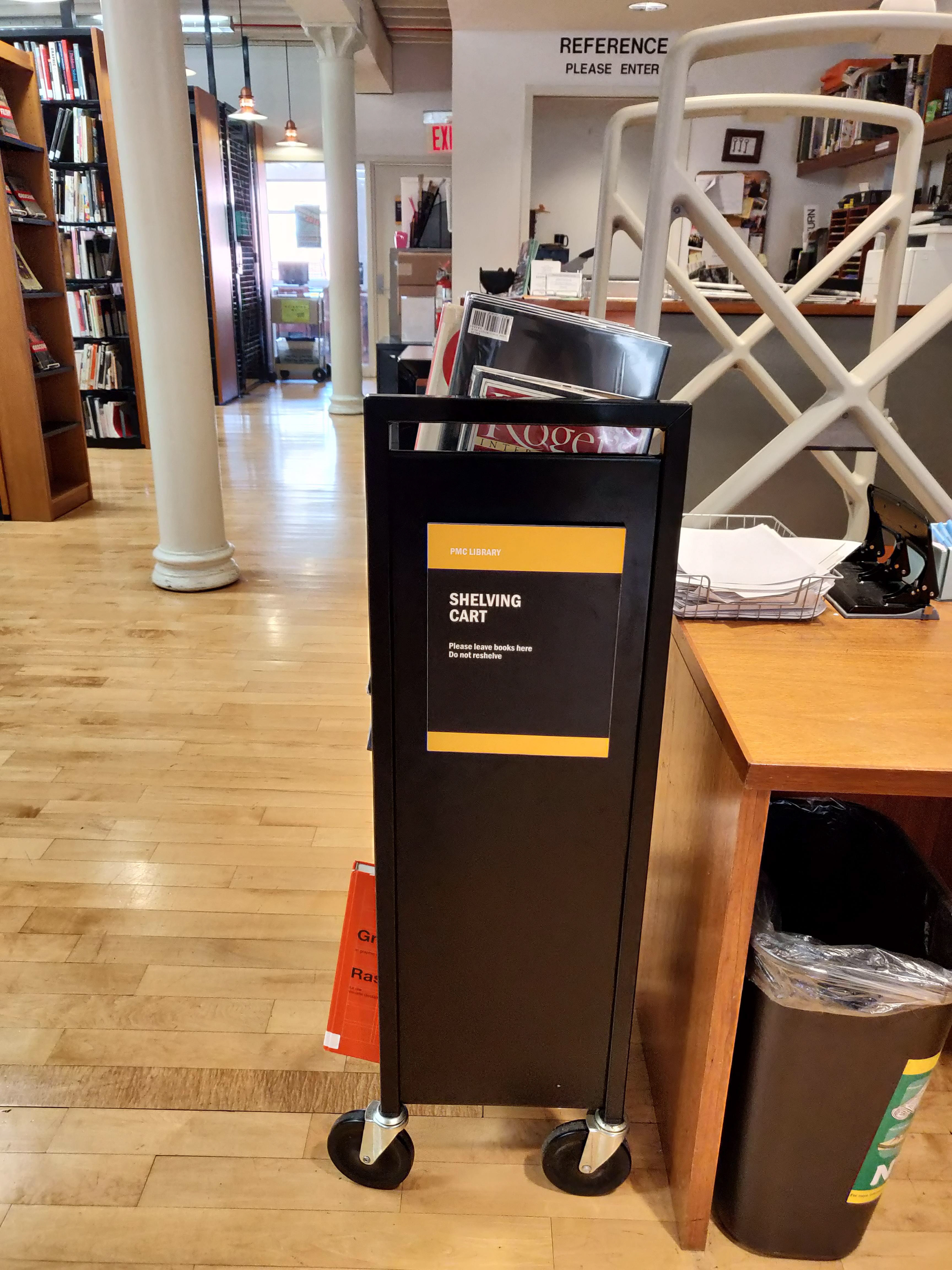
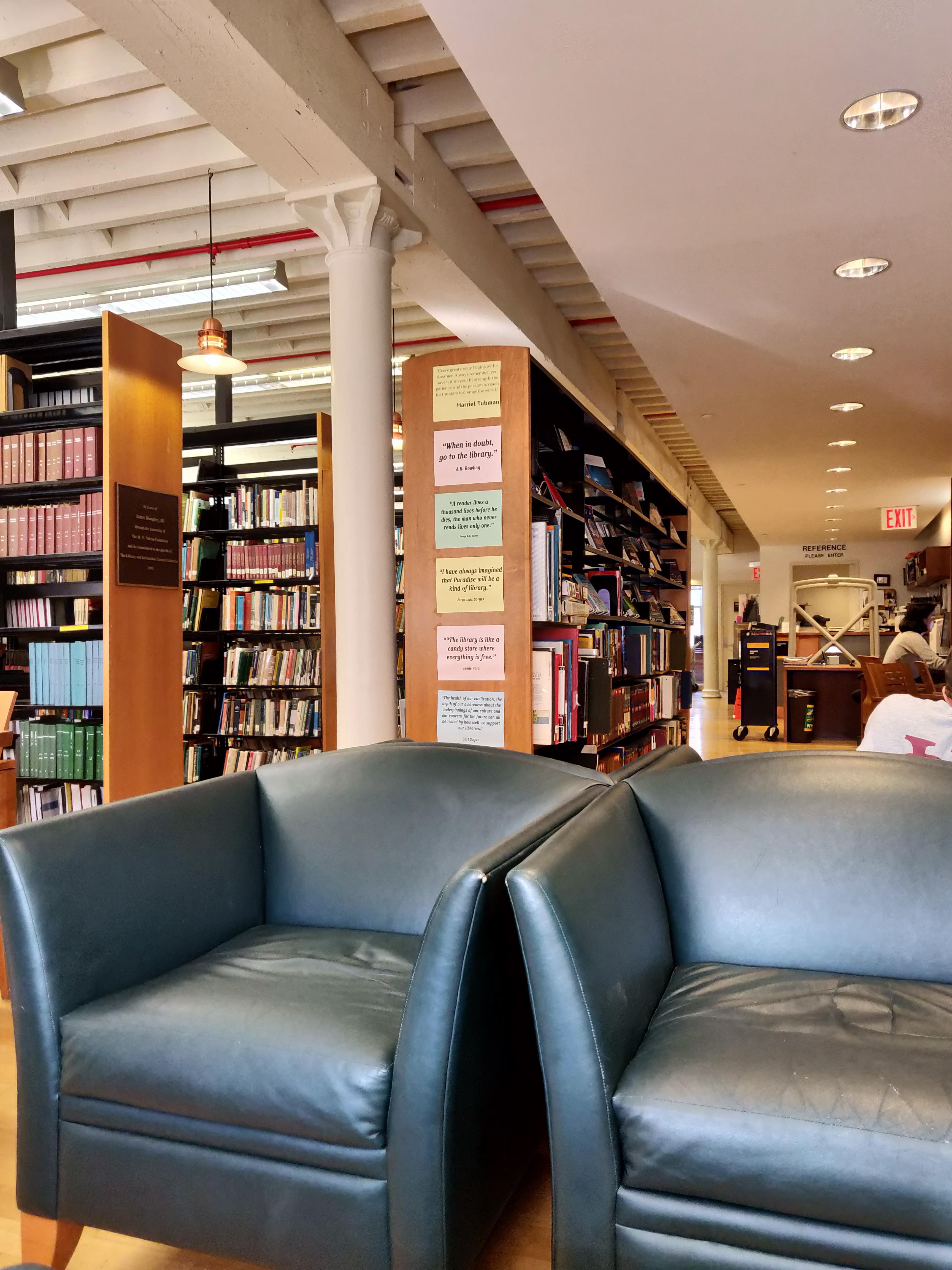
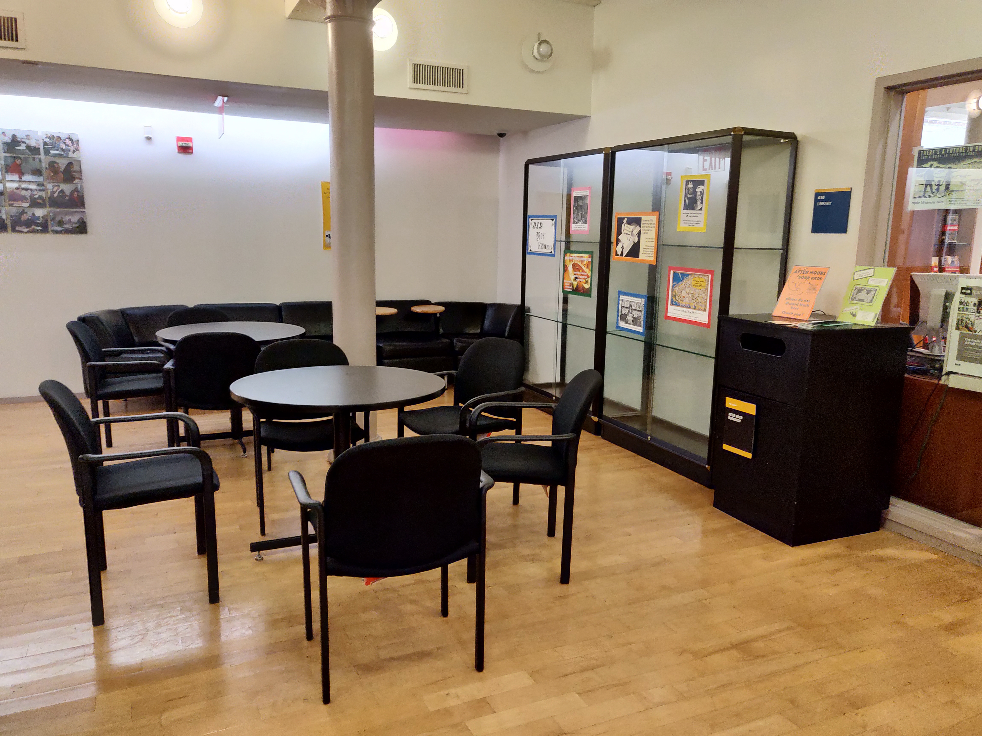
Physical Space Observations - To conduct on site observations, users experience with library physical space.
Observing Library Space
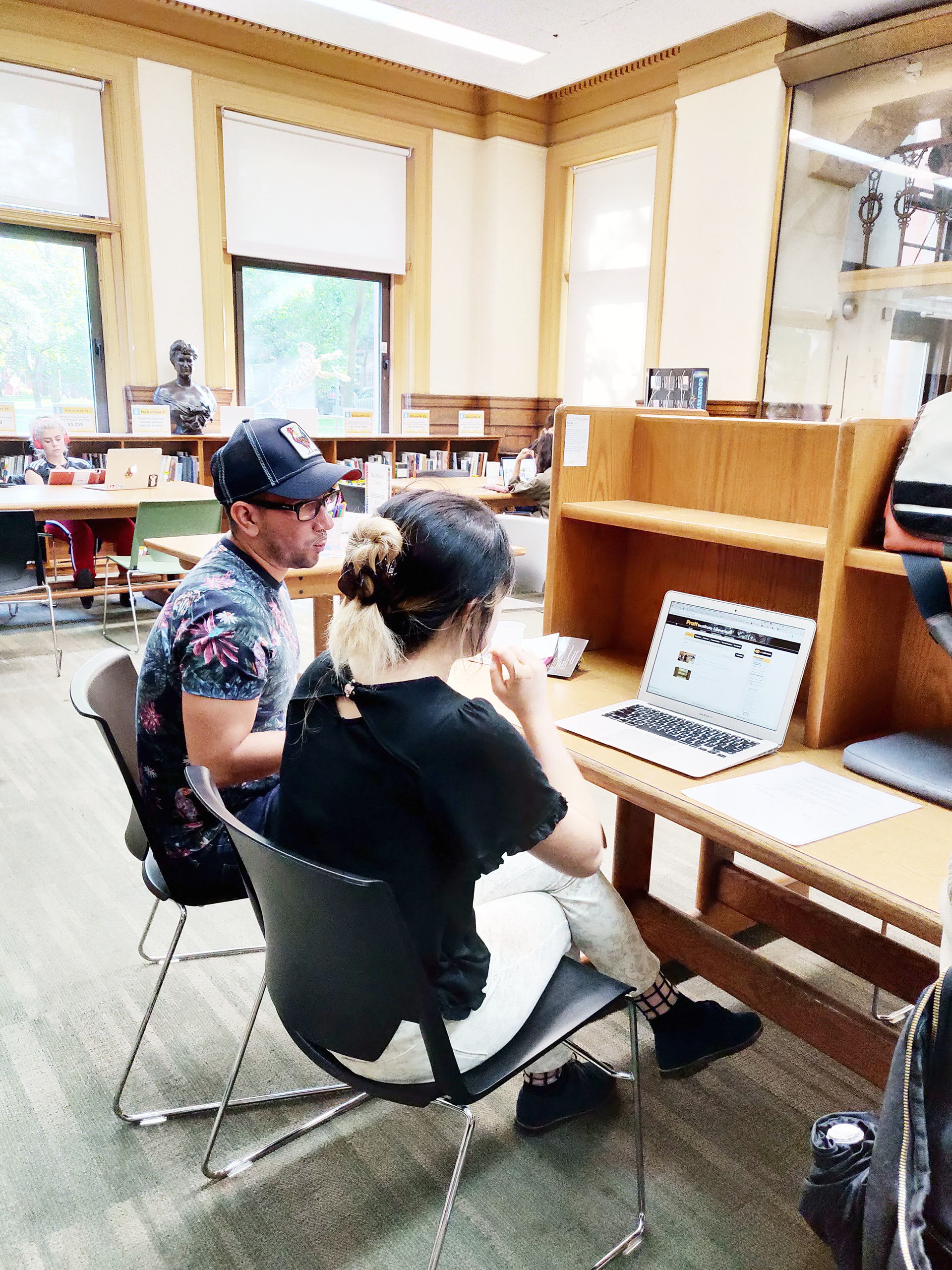
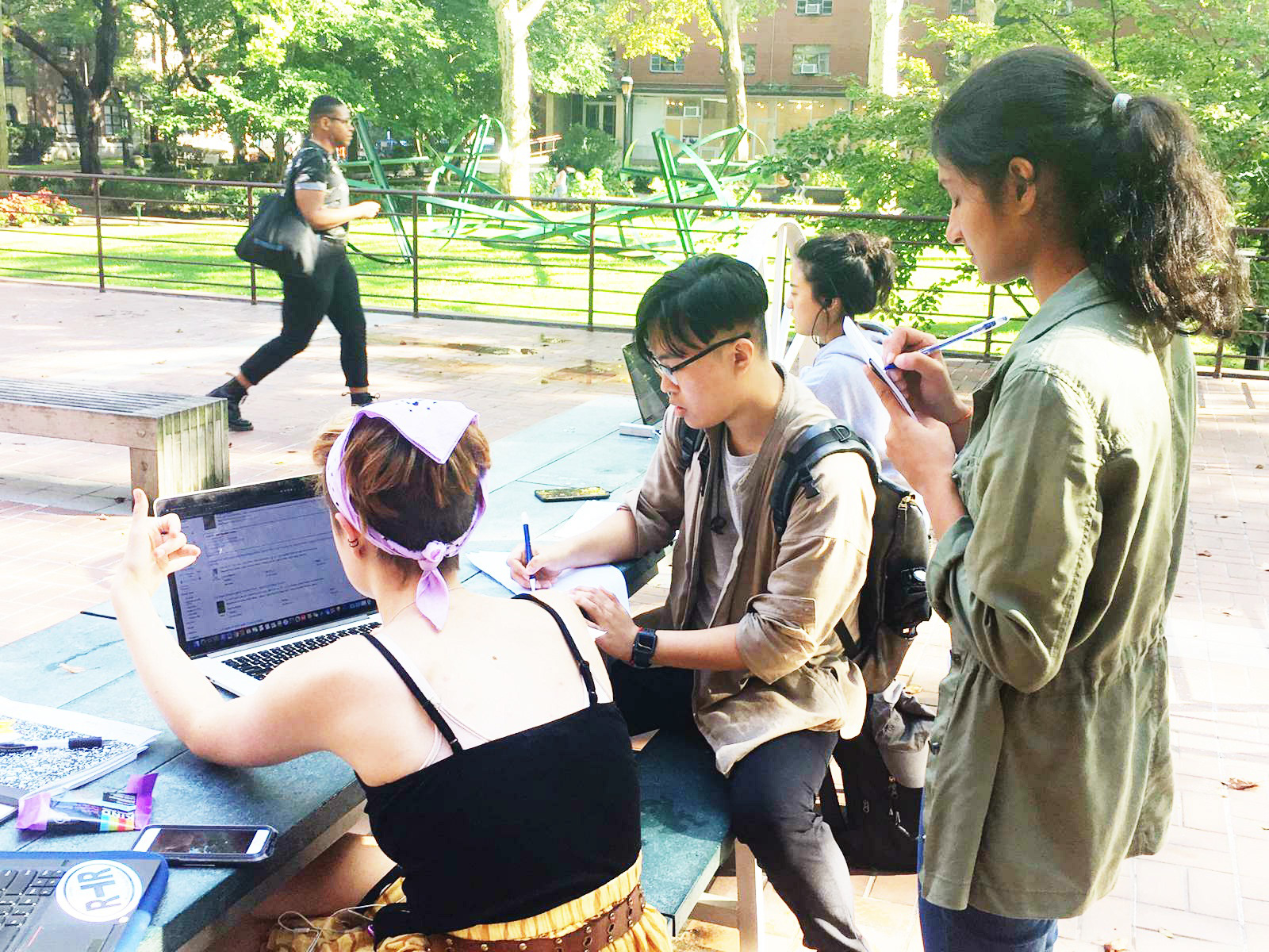
I participated in conducting on site Observations. The Observation Group(Yang, Christian and I) created a research plan, which was designed keeping in mind that Pratt Libraries is located at two different locations (Brooklyn, Manhattan) and each location may have its own essence and way of functioning. Also, we decided to conduct Task observations(observing the users as they performed tasks using the website) so that we could observe users in-library experience holistically (Searching a book on the website to finding the book in library and issuing it).
Analysis
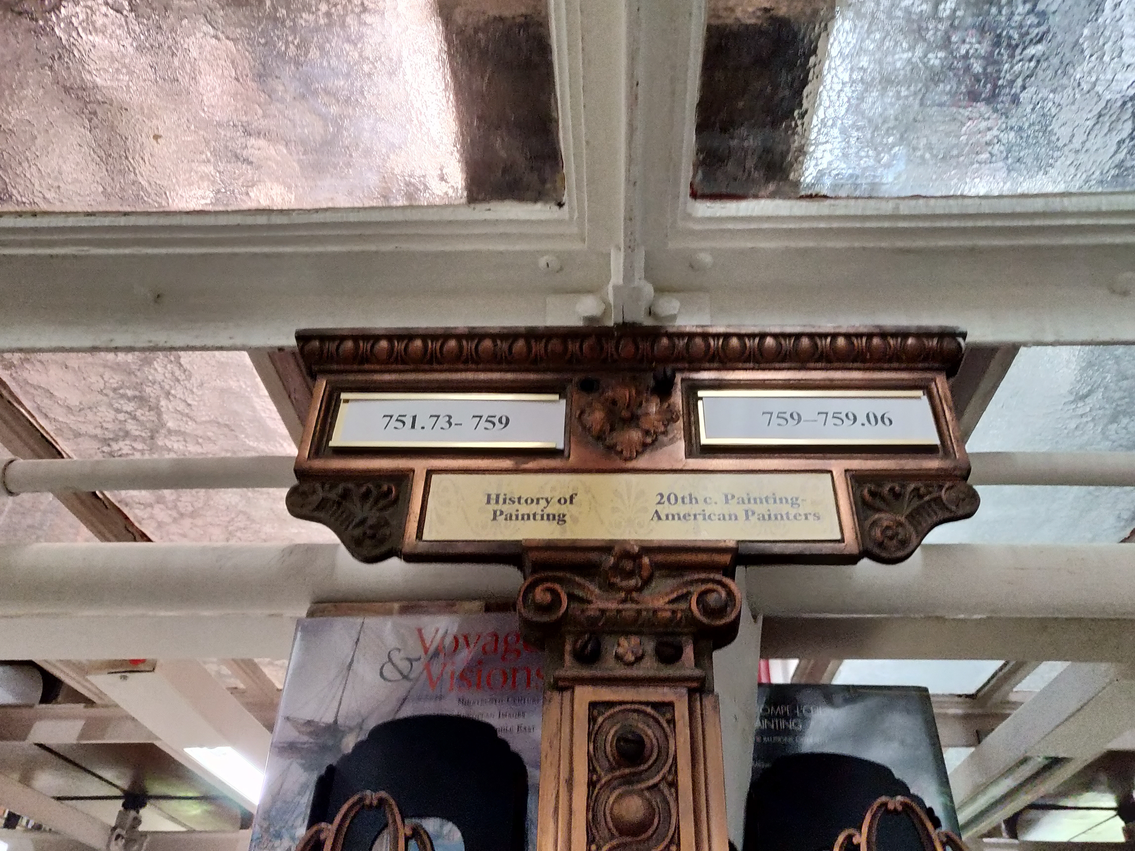
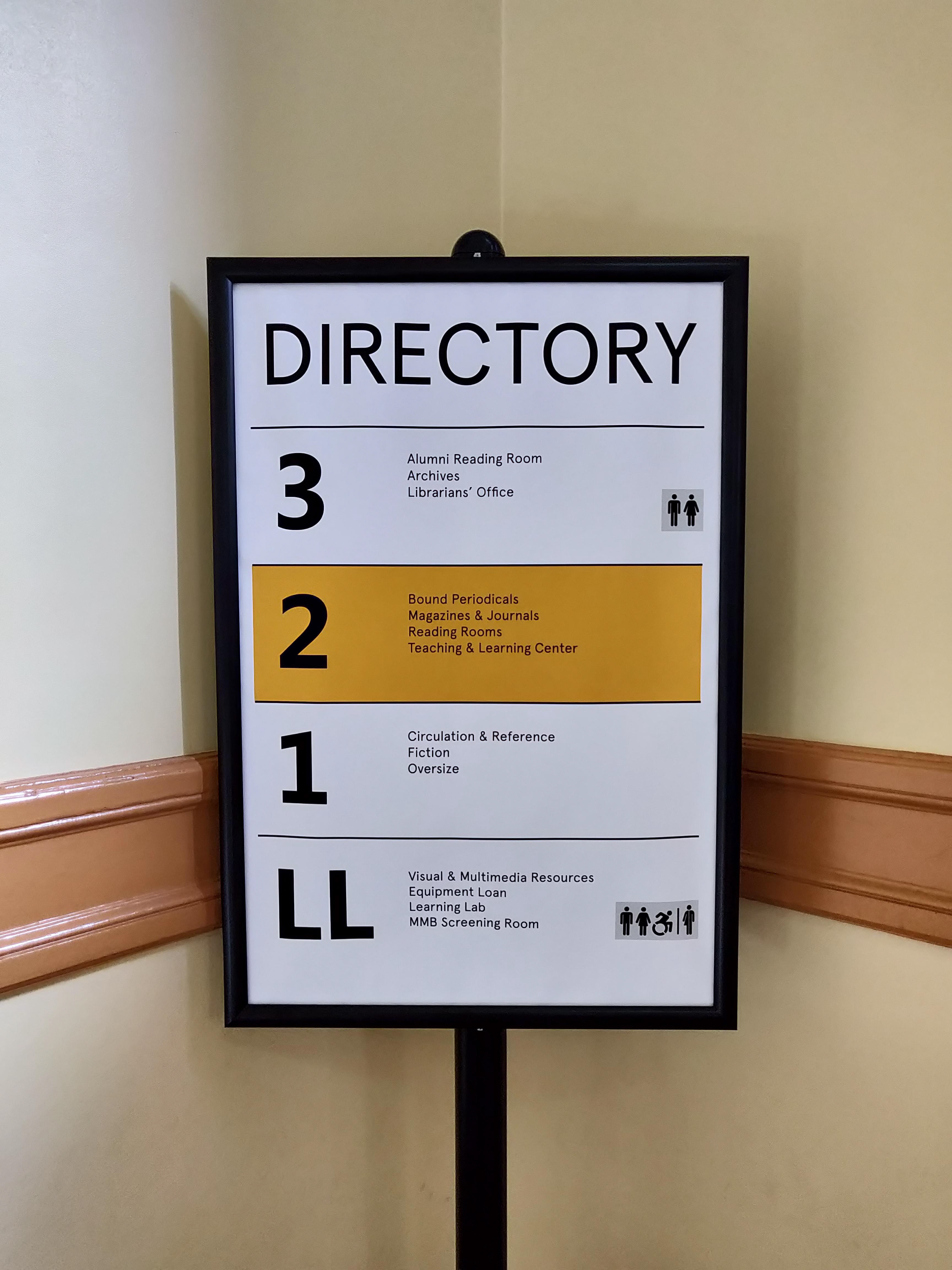
All the data from six observations were collaborated to recognize the problems faced by the users of the library. Our focus was not just to identify the existing pain points, but also discover the themes/ideas that directly/indirectly coerced in improving the library experience. We used Realtimeboard, an online software to map all the data collected and started identifying recurring patterns. Also, we decided to perform individual analysis for both the campuses as they differed on grounds such as the campus size,avaliability of resources and services, staff strength.
And we learnt a lot!




Ideation and Brainstorming
At this point, we divided ourselves in five research groups-
Website Redesign - Focussed on redesign the Pratt Institute Libraries website
Information Architecture - This group focussed majority on content strategy for the Pratt Libraries website, creating a site map and evaluating the voice/tone of the website.
Physical Space Recommendations - They worked on providing recommendations to improve the In-Library Experience for Patrons.
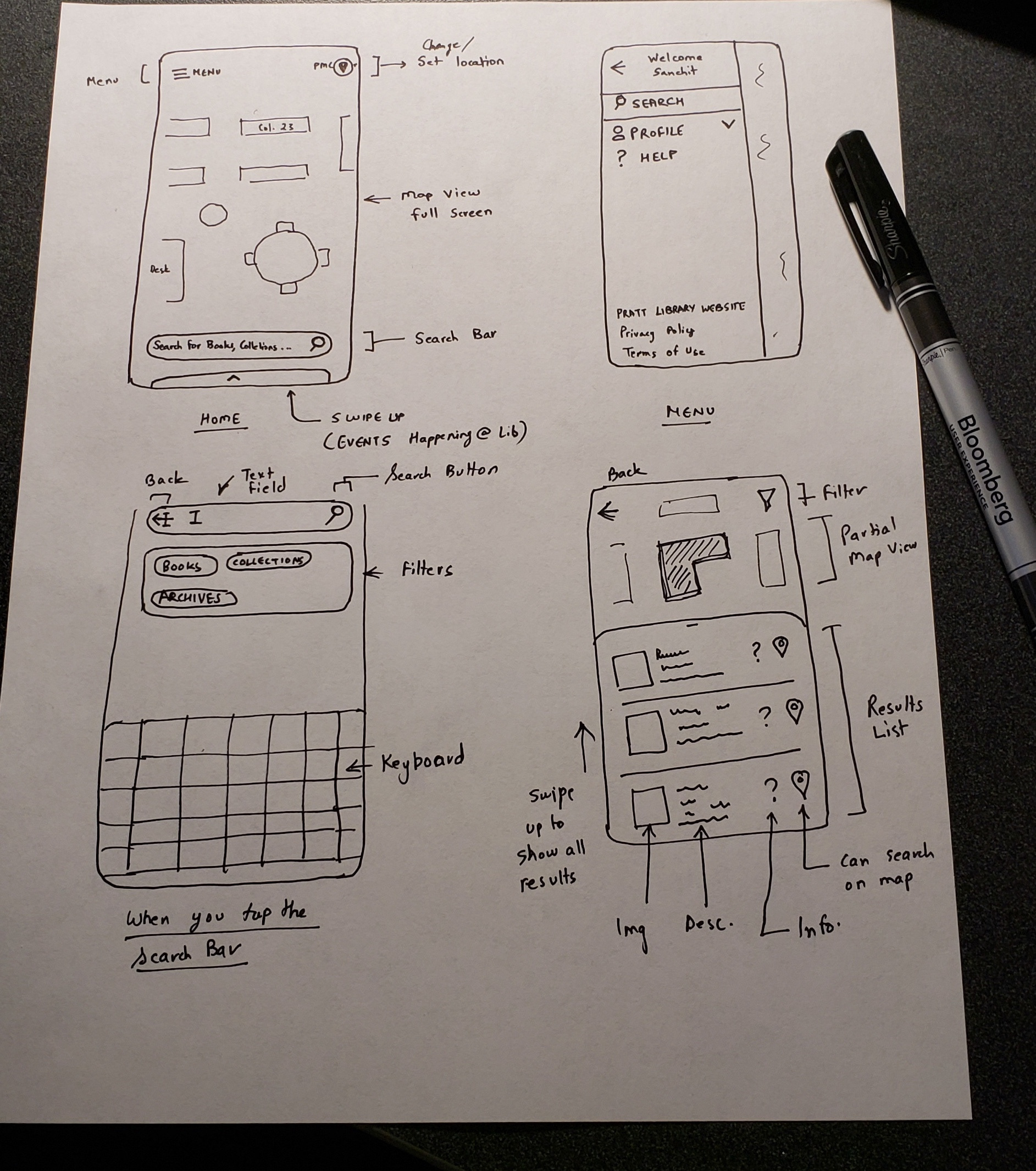
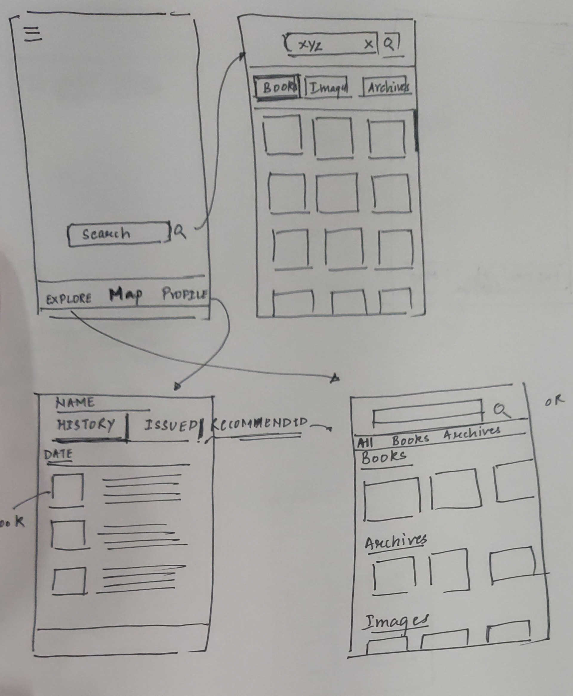
Mobile Companion App - We (Sanchit, Harry and I) focussed on developing an application for the patrons that would assist with navigating through the library and stacks, thereby improving the 'In-Library Experience' for patrons
User Stories
Competitor Review
We did not have a direct competitor as not many libraries have a mobile app for navigating through the physical space. So we looked into applications for museums that provide similar features. My team member (Sanchit) and I reviewed Franklin Institute and Museum of Natural History to draw inspirations.
Wire-framing and Prototyping
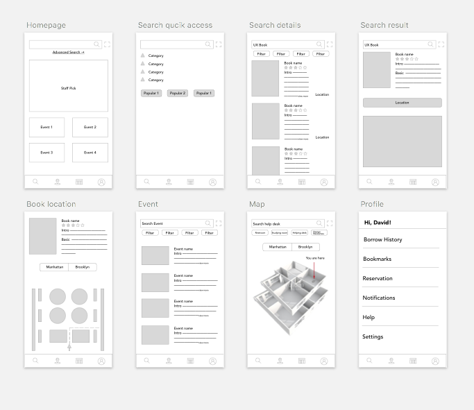
Our sketches and wireframes were based on pre determined User Stories and what we learned from the competitor reviews. The goal was to provide services to the patrons that would enhance the In Library Experience.
User Testing
To get some quick feedback from our target audience, we first created a task list to be performed by our intended target audience on the lo-fidelity prototype, followed by a dry run test. In all, we conducted 8 user tests, out of which 2 were conducted by me.
Key Findings
Hi-Fidelity Prototyping
For the style guide of the Companion App, we decided to follow the style guidelines adopted by the website redesign team, to make the Pratt Libraries brand and identity consistent throughout its web presence.
Also, we reached out to the Content Strategy team to incorporate the redesigned Information Architecture into the companion app as per the requirement. We all paid close attention to make the voice and tone of the application consistent with the website.
Final Presentation
All the processes, findings, products and deliverables were presented to the Pratt Libraries Staff. Presentation was followed by a Q and A session, where the Pratt libraries staff shared their thoughts and opinions. Even though Companion Application was considered as a future project, they sounded really excited about the features/services offered by it.
We talked heavily about the feasibility and viability of the application as a whole. Some of the suggestions that were put forward revolve around seeking help from other departments within Pratt institute working on similar deliverables.
We also discussed about how could patrons be made aware of Companion App as it is usually difficult to ask users to download an application, for which the team suggested to market it at Pratt Institute's website and during the orientation sessions for incoming students.


Reflection
Communicate- When you are collaborating with a number of professionals, it is important to communicate your thoughts/ideas, give and receive feedback on your approach/design decisions.
If you don't know, ask- If you don't know about a certain process/design/tool/framework, it is important to ask your peers or research about it. For instance, I asked my peers to help me out with Adobe XD as it was first experience with XD.
Include Stakeholders in your process- It was really important that we connected with stakeholders, kept them up-to-date about the project, receive feedback on our products. I realized that the designed products or services would be accessed by the target audience, but it would be constantly handled and managed by the stakeholders/staff.
Service Design- Online and offline presence of an organization/institute can't be considered as separate experiences. We adopted a process(Interviews/surveys/space observations/competitive Analysis)which helped us to design experiences that would help patrons to get the best end-to-end service.
You are a part of a process -I realized that I may not be a part of every design/research process adopted to develop a product, rather working only on a specific part/process of the product. Thus, it is imperative to constantly talk to your peers, keep yourself updated of the latest development across the project , understand the research/design decisions across the project which may turn out to be extensively resourceful for your design/research process.


